Culture
Baselworld 2015: Top Four Watches the Web Loves to Hate
Well, it’s over – Baselworld, that is – although the annual storm of opinions, counter opinions, and castigation that some of our favorite watch brands generated will endure for months, if not years. Watch lovers – especially online – never met an utterly inconsequential tempest in a teapot they didn’t like and this year was no exception.
Here are four hapless timepieces that the Internet loved to hate.
Omega Globemaster
It’s a nice watch, with a nice movement: the Omega caliber 8900, self-winding, COSC and METAS certified. It’s impressively resistant to magnetism, shrugging off fields of up to 15,000 gauss (a lot). It’s got a nice pie-pan dial, and in steel it comes in at under $8,000, which is, nowadays, not such a savage price for a wristwatch with a bunch of nice details and an in-house, technically sophisticated movement. Its crime against watch-nerd-dom (and against humanity) is that it has a fluted bezel.
The vitriol heaped upon it for having a fluted bezel was considerable, with Omega standing accused of plagiarising Rolex. Never mind that Omega used fluted bezels freely on Constellations in the 1960s.
Omega makes a watch with some great shout-outs to much-loved classics of the past, with a movement using the only viable alternative to the lever escapement to make it to mass production in 250 years, that can take pretty much anything modern life can throw at it and look sharp doing it; and for its pains, Omega gets the torch-and-pitchfork treatment. We can’t have nice things, can we.
Laurent Ferrier Square Galet
This is another example of a perfectly nice watch using perfectly normal – indeed, virtually ubiquitous –design cues from the history of watchmaking, and getting lambasted for an incidental resemblance to another brand that did not invent those design cues, but whose use of them looms large in the minds of watch enthusiasts.
Sniffed one commenter, “The case copy Panerai Radiomir and the price like Patek (sic.) Sorry, with this price I go for other better brand with longer history like JLC or Patek.” Yeah… except the cushion case is not a Panerai invention. And c’mon. There’s a nice sunray-brushed dial, lovely Laurent Ferrier hands, the bezel geometry’s not the same… and besides, the idea that Laurent Ferrier might have consciously aped Panerai is simply absurd.
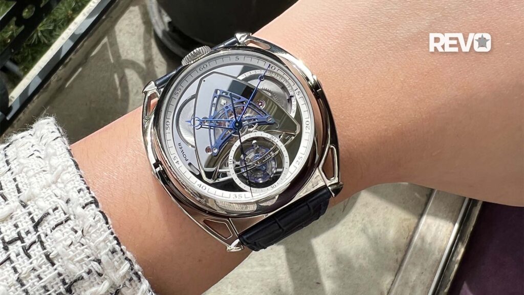
Angelus U10 Lumière Dead Seconds Tourbillon
This one is an object lesson in the importance of sleeping on it before posting a scathing condemnation. When I first got the press release, I, too, lost it. My first reaction was, “Angelus coming back? I can’t wait – hope they do some nice, faithful-yet-tastefully-updated homages to the company!” My second reaction after seeing the watch was, “Good god, what eldritch abomination has this company loosed upon us?” It seemed yet another example of a good old name being resurrected to support a ghastly, outlandishly over-designed tourbillon.
Problem is, it’s grown on me. After seeing it “in the metal,” I now think it’s actually a very good watch. The design borrows a few cues from Angelus watches of the past but the use of the deadbeat seconds – a nod to the quartz watches that killed the original company – and the suspension of the tourbillon in its own sapphire pod, along with the vintage analogue radio-dial styled power reserve, make the whole thing work, albeit in a most improbable way. So much for first impressions being correct.
LOOK THE BEAST IN THE EYE
Patek Philippe Caltrava Travel Time
You haven’t seen so many people get upset over an unexpected cosmetic change in direction since Keri Russell got a haircut and single-handedly sank Felicity. And judging from the first reactions to the new Calatrava Travel Time, you’d think it had a case made from poached elephant ivory and that its gears were lubricated with orphan’s tears.
The crime: making a watch styled like a 1920s pilot’s watch. The Other Brand brought in kicking and screaming for invidious comparison: Zenith. The Calatrava Travel Time, however, has nothing to do with Zenith (of course) and its use of fat, luminous Arabic numerals and Superluminova-filled hands merely echoes what were, in the 1920s and ’30s, very common design cues in instrument watches.
One of the kinder remarks we read was, “Timex look without a Timex logo.” Patek may have the last laugh (again), though. CEO Thierry Stern, whom I ran into at Patek’s stand after seeing the watch in person, said (with a touch of weariness) “Do you know how many people come in the booth and say, ‘I hate it, why did you do that?’ and then say, ‘but can you reserve one for me?’”
Watch lovers are like any mob of so-called connoisseurs – arguing over minutiae is not only commonplace, it’s actually part of the fun. As Kenneth Ullyett so keenly observed in his delightful book Watch Collecting (1970), “A detailed diary from John Arnold would have settled many of the continuing arguments about the originator of the lever escapement, albeit many keen horologists would have been denied the pleasure of getting angry with each other.”
Photos by Adi Soon and Jack Forster for Revolution Online.


