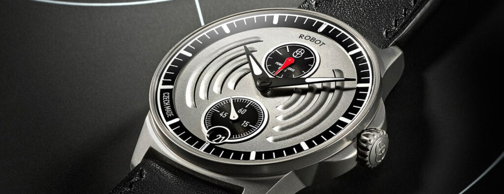

Audemars Piguet
The Watch Face: Dive Watch Dials
Audemars Piguet
The Watch Face: Dive Watch Dials
For the first 30 years of dive watch production, dials, as with Henry Ford’s Model T motorcar, were any colour you liked so long as it was black. First Panerai, then Rolex and Blancpain continues this monochrome trend until finally, in 1967, a splash of colour pierced the darkness in the form of the Doxa Sub 300 with its fluorescent orange dial. Since then, black has continued to dominate the dive watch market, with dark blue being an occasional nod to maritime styling. Why are colourful dive watch dials so rare compared to black and what is so special about orange?
Where do the colours go?
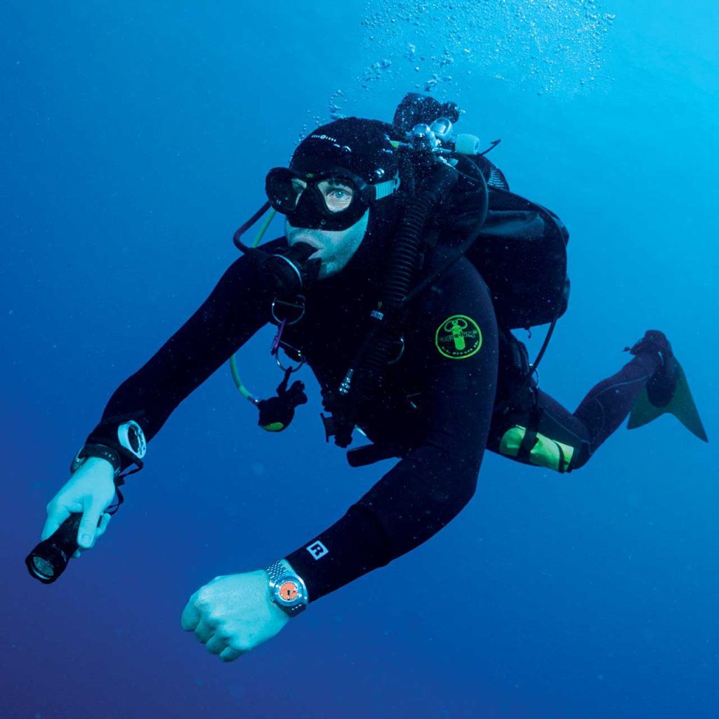
The first thing to realise is that, no matter how clear it is, water absorbs light. Below 300m all light from the surface will have been absorbed so unless you have taken a light source down with you or your watch has luminous dial details, it will be pitch black.
Pure water absorbs the different colours of the spectrum at different depths, but contaminants such as suspended or dissolved particles and organic matter will shift that absorption dramatically. Add to this the fact that the human eye does not detect all colours equally either and the picture becomes complex.
In pure water, red disappears below 5m, orange at 20m and yellow at 50 with green visible at 110m and blue light making it down to 275m. Unfortunately, it is red, orange and yellow that the human eye is most sensitive to, while the green and blue are harder for us to detect. In more murky water the situation is very different. Shorter wavelength light such as green and blue are scattered and in the circumstances of reduced visibility, paradoxically, orange is left as the easiest to see.
Doxa 50th Anniversary SUB 300 Professional
Born in the Murky Depths
This chimes with the origin story of the Doxa Sub 300, the company claims that various colours of dial were tested in the waters of Lake Neuchatel and that orange was deemed to be the most visible. Given that the lake was, at the time, quite polluted and would also have been contaminated with both silt and organic matter, this makes sense for this location but possibly not for much cleaner waters. These findings are also backed by a US Navy report no. 503, by J.A.S. Kinney, S. M. Luria and D. O. Weitzman, published in 1967 on ‘The Visibility of Colors Underwater’, who tested a range of colours in water of varying clarity. In clearer water they also confirmed that blue and green became most visible.
Adding more Glow
The most striking aspect of the report was on the effectiveness of fluorescent paint. Fluorescence is a process by which a paint will absorb ultraviolet light and then emit the light of the colour that we see. The emitted light is added to the light naturally reflected by that colour in an ‘amplifying’ effect.
It just so happens that ultraviolet light penetrates deeper than orange in clear water and so a dial painted with fluorescent material would emit orange light and so still be visible at greater depth. Of course, orange is one of the colours that our eye finds it easier to see, enhancing the result. Fluorescent orange can outperform not only regular orange in murky water but other deeper penetrating colours in clear water. It is only beaten by fluorescent yellow and green in clear water at depth and for shallow clear water it remains in first place.
So why do we not see more variation in fluorescent colour dive watch dials? Aside from a recent flurry in the last few years from Audemars Piguet and Victorinox, yellows and greens remain rare. I would suggest that it comes down to a ‘first past the post’ approach. If you are pitching your watch as a professional tool you will choose the best colour, orange, and no other.
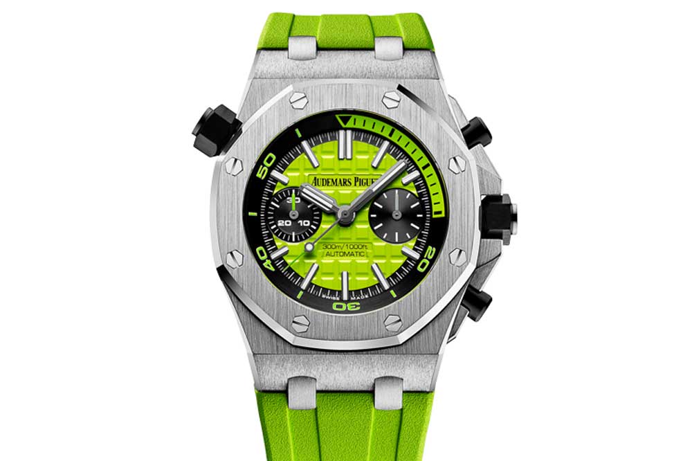
Royal Oak Offshore Diver Chronograph
Back to Black
So, where does this leave black dials? The 1967 US Navy report specifically mentions black as a colour that had been mooted as highly visible underwater but was found to be the hardest of all to see. The question is not one of visibility but legibility. As the light fades underwater and all the colors begin to wash out, contrast is king. The US Navy suggests black and orange as a high contrast combination and this is the colour scheme followed by Doxa with large, blocky, black hands but you can’t get better than black and white, especially if the white is a large swathe of luminous material providing its own light source at any depth. To see your dial, orange might be a better option; but you are not trying to locate your watch as you might a rescue buoy because… there it is at the end of your arm. To actually read the information, the dial that displays black and white is best.
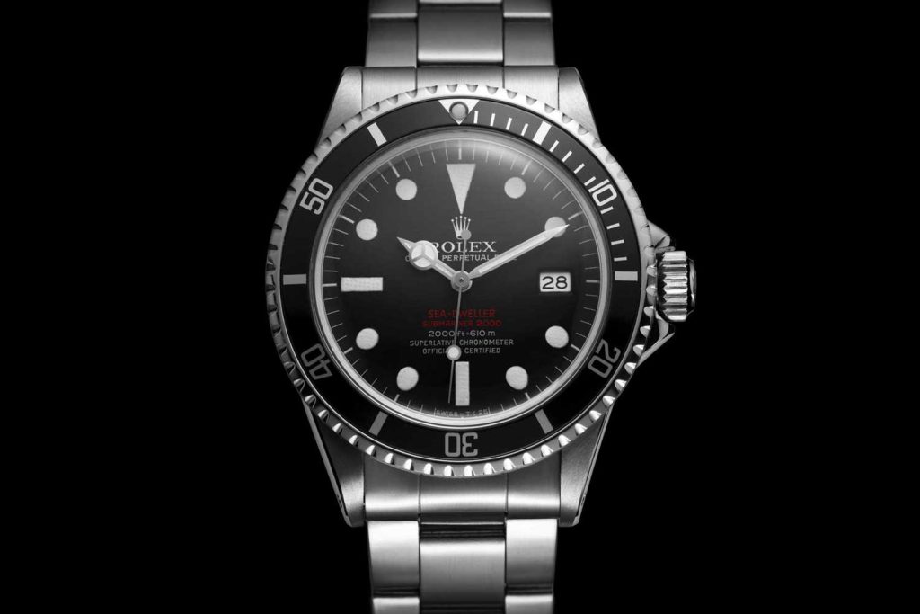
Rolex Sea-Dweller